Custom editor controls in Unity - Part 5: Custom styles
Sometimes it becomes necessary to define custom GUIStyle’s to get the most desirable
user experience from your editor controls. Custom styles can be defined using a number of
different approaches. You can create GUISkin asset files; custom asset files or simply
write some code that creates the GUIStyle’s programmatically. The latter is nice when
you want the styles to be embedded into a DLL.
One of the patterns that I frequently use to construct custom GUIStyle’s is to
automatically initialize them on access since often it is desirable to build upon existing
editor styles and unfortunately you can only access those during GUI events:
public static class MyStyles
{
    private static bool s_HasInitialized = false;

    private static GUIStyle s_HeadingLabel;
    private static GUIStyle s_PaddedButton;


    private static void AutoInitialize()
    {
        if (s_HasInitialized) {
            return;
        }

        // Style: Heading Label
        s_HeadingLabel = new GUIStyle(GUI.skin.label);
        s_HeadingLabel.fontSize = 24;
        s_HeadingLabel.normal.textColor = EditorGUIUtility.isProSkin
            ? Color.white
            : Color.black;

        // Style: Padded Button
        s_PaddedButton = new GUIStyle(GUI.skin.button);
        s_PaddedButton.padding = new RectOffset(15, 15, 15, 15);

        s_HasInitialized = true;
    }


    public static GUIStyle HeadingLabel {
        get {
            AutoInitialize();
            return s_HeadingLabel;
        }
    }

    public static GUIStyle PaddedButton {
        get {
            AutoInitialize();
            return s_PaddedButton;
        }
    }
}
Important - When working with colors and textures it is important to test custom styles on both the light and dark skins of the Unity editor to ensure that the control is usable on both. You can use different styling for the light and dark skins by testing the
EditorGUIUtility.isProSkinproperty that Unity provides.
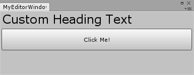
These custom styles can then be used when creating editor interfaces:
GUILayout.Label("Custom Heading Text", MyStyles.HeadingLabel);

if (GUILayout.Button("Click Me!", MyStyles.PaddedButton)) {
    Debug.Log("You clicked me! <3");
}
And here is what you’d get:
